October 27, 2026
The Logo Was Never the Problem
Most companies that ask for a new identity are describing the right symptoms and the wrong problem.

By Jacob+Viktor
Almost every request for a new identity arrives wearing the same disguise. A company says its brand looks tired, that the logo no longer feels current, that the competition looks sharper and more certain. The symptoms are described with real precision — a good marketing director can itemise exactly what feels wrong — and they are almost always true. What is rarely said, because it is harder to admit, is that the discomfort has very little to do with how the brand looks. It has to do with what the brand has quietly stopped being willing to say.
You can watch it happen in a single meeting. Someone pulls up the logo, or the homepage, or a competitor's new campaign, and the room leans in. Opinions arrive instantly and with surprising heat — the typeface, the colour, the tone of a headline. Then someone asks a quieter question — who exactly is this for, and what are we asking them to believe that no one else can credibly say — and the room goes still. The energy was never really about the logo. The logo was simply the one thing in the room everyone felt entitled to have an opinion about.
An identity is a consequence. It is the visible residue of a decision an organisation has already made about who it is for, what it refuses, and what it is prepared to be worse at in order to be unmistakable at one thing. When that decision is clear and genuinely held, the identity almost designs itself; the hard choices were made upstream, and the designer's job is to give them a form sharp enough to be remembered. When the decision has not been made — or was made years ago, in a different market, and quietly abandoned since — no amount of redrawing rescues it. You end up, at considerable expense, with a more beautiful expression of nothing in particular.
A sharper image of an unclear strategy
This is why so many rebrands fail in a way that is genuinely difficult to diagnose. On the surface, everything improved. The typography is more confident, the palette more disciplined, the website faster and better photographed. The before-and-after looks like a triumph, and for a quarter or two it feels like one. And yet, a year later, nothing that matters has moved — not preference, not price, not the calibre of the clients who show up, not the rate at which good people say yes. The work was good. It was simply aimed at the wrong problem. A sharper image of an unclear strategy is still unclear; it is only unclear now at higher resolution.
The confusion is entirely understandable, because identity is the part of the problem you can see, and strategy is invisible until it is tested. Anyone can hold an opinion about a logo within two seconds of seeing it; nobody can point at a positioning on a wall, because a positioning is not a thing, it is a decision. So the conversation drifts, almost by gravity, toward the artefact everyone can see and judge — and the logo becomes the socially acceptable place to express a much larger and more frightening anxiety. “We need to refresh the brand” is a far easier sentence to say in a leadership meeting than “we are no longer sure what we are for.”
The question hiding inside the brief
We have learned to treat the request for a new identity as a question rather than a brief. Not what should this look like, but what has become true — or needs to become true — that the current brand can no longer carry. Sometimes the honest answer is that the strategy is sound and the expression really has aged, and then the work is exactly what was asked for, done with care. More often, the request turns out to be the first visible sign of a decision the organisation has been circling for a while without landing: a market it has outgrown, a promise it no longer quite keeps, a new kind of client it wants without being willing to disappoint the old one.
There is a simple test for which of those situations you are actually in. Ask what would have to be true for the new brand to be worth the money — and then ask whether anything inside the company would have to change for that to hold. If the honest answer is nothing, we just need to look the part, then the problem really is cosmetic, and you should treat it as cosmetic and spend accordingly, briskly and without drama. But if the honest answer touches what you sell, who you say no to, how you set your prices, or how your own people describe the work on an ordinary Tuesday, then the identity is the last thing to touch, not the first. It is the signature at the bottom of a decision, and you do not forge the signature before the decision exists.
None of this makes identity unimportant, and it is worth being precise about that, because the argument is easy to misread as a case for neglecting it. A clear strategy expressed clumsily is a clear strategy nobody notices; the form is how the decision reaches the world, and a weak form wastes a strong idea as surely as a strong form flatters a weak one. The point is sequence, not hierarchy. Strategy earns the right to an identity. Identity done first borrows a credibility it has not yet earned — and the market, which is unsentimental and has a long memory, eventually notices the loan was never repaid.
This is also where the real cost hides, and why it is so consistently underestimated. The expensive mistake is almost never the design fee, however large it looks on the quote. It is the eighteen months a company spends believing the problem has been handled — because the brand finally looks the way it always wanted to feel — while the actual friction, the one that sent everyone reaching for the logo in the first place, goes on doing its quiet damage underneath, unexamined, now camouflaged by a confident new coat of paint. The redesign bought time. It did not buy change. And time bought at that price, to postpone a decision rather than make it, is the most expensive thing a company can purchase.
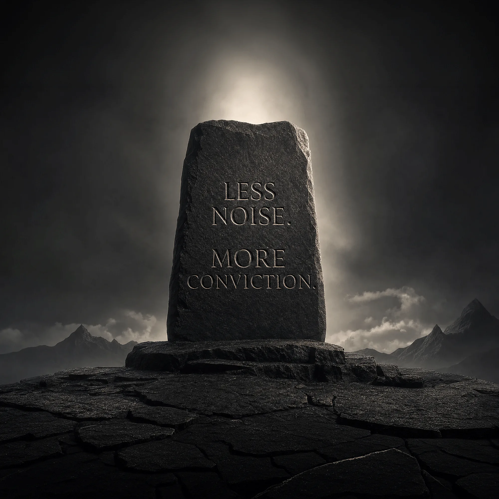
So before the logo, the question. Before the palette, the decision. A brand that knows precisely what it is willing to be worse at does not need to shout, and usually doesn't, because it is already unmistakable to the people it was built for — and comfortably ignorable by the people it wasn't, which is the same discipline seen from the other side. That kind of clarity cannot be drawn. It has to be chosen first, deliberately and at some cost, and only then handed to someone good enough to give it a form worth remembering. The logo was never the problem. It was only ever the place the problem became visible enough to talk about.